Volume UX Guidelines
To maximize your conversion rate and customer adoption, it's crucial to focus on the following:
- Ensuring the Volume button’s size and design align with your overall UX and other payment method options.
- Optimizing the placement of the Volume button at checkout for visibility and ease of access.

Button designs
Our button designs are highly adaptable to accommodate your current layout. If none of the designs provided align with your existing payment methods setup, please feel free to submit a feature request (opens in a new tab) for further customization.
Mobile button designs
| FIRST TIME | RETURNING CUSTOMER |
|---|---|
| First time users are shown the variety of bank options available. | Returning users are displayed their previous selection to reduce friction and reduce dropoff. |
| Standard Implementation | |
| This implementation utilizes the standard volume button to manage customer interactions. It is particularly effective when payment methods are presented as actionable buttons, providing a seamless and intuitive user experience. The following component is designed to function as a fast-checkout option. It should be strategically positioned on the product display page or the final payment page. When clicked, the button will seamlessly trigger the opening of the banking app for quick and secure payment. | |
 |  |
| Radio Buttons Implementation (VolumeSelector) | |
| Radio buttons enable users to choose from multiple options before making a final selection. This button is best suited for payment selection pages before the final checkout. We strongly recommend setting our button as the default option to streamline the user experience and guide decision-making. | |
 |  |
Standardised Copy
Our copy is carefully crafted to raise consumer comprehension and understanding of our product, so please ensure all components adhere to the below illustrated standardized copy.
- Primary CTA Text should always be Pay by Bank App
- Secondary CTA Text (where relevant): Safe, Easy, and Bank-protected

Desktop button design
| FIRST TIME | RETURNING CUSTOMER |
|---|---|
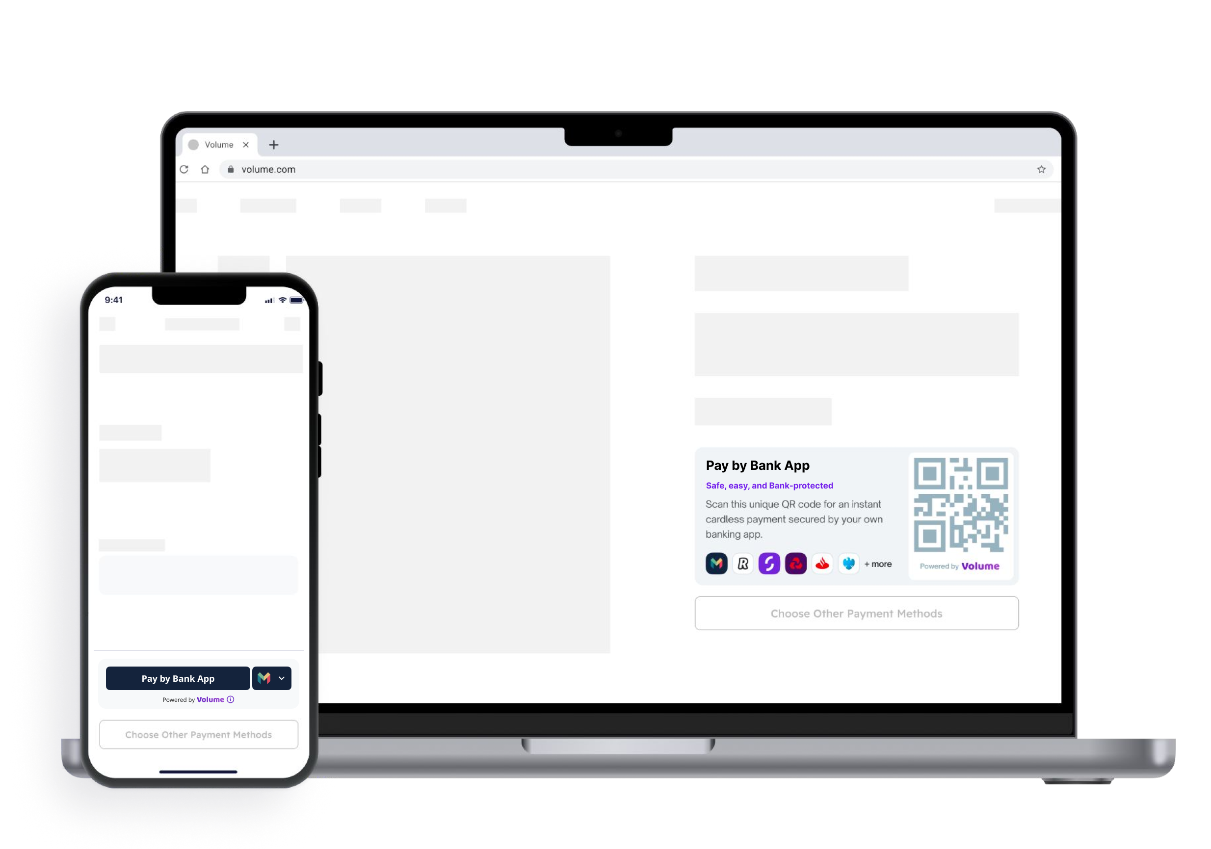
| The desktop implementation generates a QR code that customers can scan to proceed with payment authorization through their banking application. | |
 |  |
Informational Buttons
Info button
Clicking on the information icon  will trigger a pop-up that provides a detailed explanation of what "Volume" means. This feature aims to enhance user understanding and build trust in the payment method.
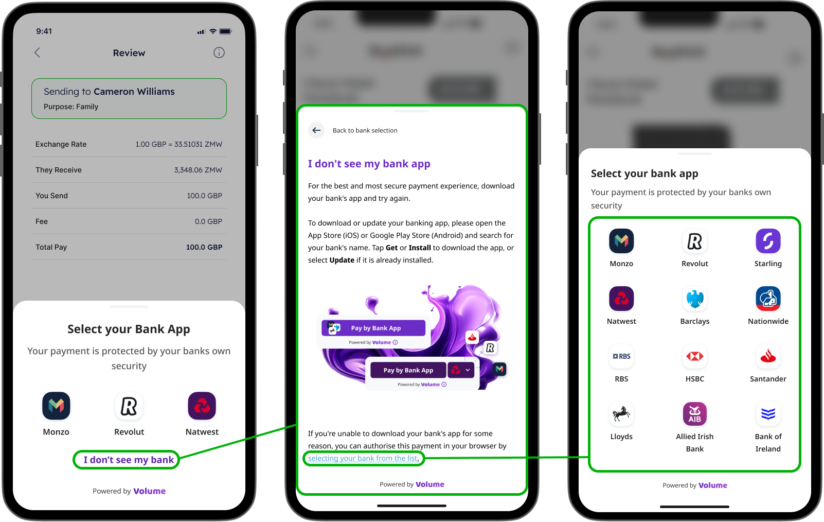
I don't see my bank
If users are unable to locate their bank, they can click on the “I don’t see my bank” icon. Volume will then provide instructions on how to download the banking app. Alternatively, customers can complete payment authorization using their mobile browser.

Button Positioning
Where to display the button on iOS and Android mobile devices?
- Volume button should stand as the leading payment method at checkout, designed to influence customer decisions by offering a more secure, faster, and cost-effective option compared to alternatives.
- Customers can immediately recognize the logo of their preferred bank, increasing the likelihood of selecting this payment method. The display of multiple bank logos enhances visibility and encourages users to choose the method they trust.
The Standard Volume button is most effective when other payment methods are available as actionable buttons. To maximize adoption rates, position the Volume button at the top of the list.
If your current payment methods page uses radio buttons, incorporating the Volume radio button design will ensure compatibility with your existing layout. To maximize adoption rates, set it as the default option and position it at the top of the list.
Where to display the button on web desktop?
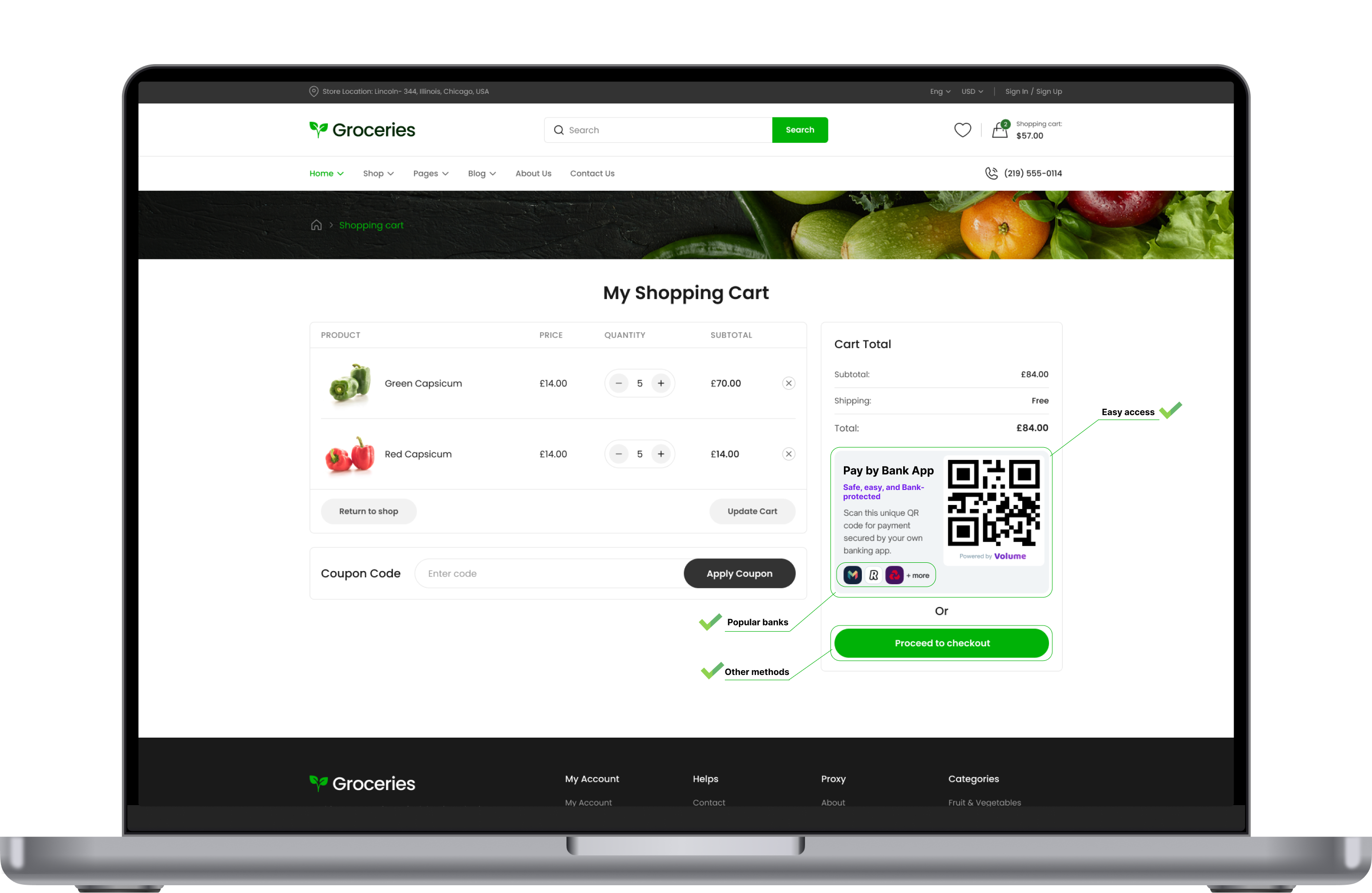
- The Volume button is the primary payment method at checkout.
- The QR code is prominently displayed to customers, featuring the logos of their bank apps.
- Alternative payment methods that require multiple pages are accessed by clicking a button.

Best practices to increase users adoption
- The volume option is the default payment method.
- Other payment methods are grouped under a dedicated button for additional payment options.
- Returning customers will see their previously selected bank immediately, enabling a one-click checkout experience.
- Customers will save at least £0.01 when paying with Volume compared to traditional payment methods.
- The buttons lack information that could influence customers choice.
- The payment methods section looks overcrowded.
- The buttons may appear small, potentially leading to accidental clicks.
Button Sizing
Adjust the corner radius to match the appearance of other payment buttons. By default, Volume has rounded corners. You can change the corner radius to produce a button with square corners or a capsule-shape button.
Examples of good implementation
All interactions for returning customers
Returning customers can make payments with a single click in your app and authorize the transaction using biometrics for secure processing.
All interactions for new customers
- Customers will see rotating icons of popular banks, allowing them to quickly determine their choice of bank.
- Volume scans the customer's device to identify installed banking apps, displaying only relevant options.
- Volume will remember the customer’s choice for future transactions, eliminating the need to repeat previous steps.
- Customers will be redirected to their banking app for authorization.
- The bank will display a payment summary to the user.
- That's it! Volume will happily return the customer to your app with all the payment details!
Volume Trademark
Use Volume graphics to show that Volume is an available payment option when you show payment options to your users.


